Hey there, fellow developers! After spending countless hours optimizing images across dozens of Next.js projects, I’ve got some battle-tested insights to share about the powerful Nextjs image (next/image) component. Let’s dive into why it’s a game-changer for modern web development.
💡 Why Should You Care About Image Optimization?
Let’s be real – we’ve all been there. You build this amazing website, but it loads slower than your grandmother’s Internet Explorer 6. According to Web Almanac’s 2023 report, images make up around 45% of an average webpage’s total size. That’s huge!
🛠️ Enter Nextjs Image Component
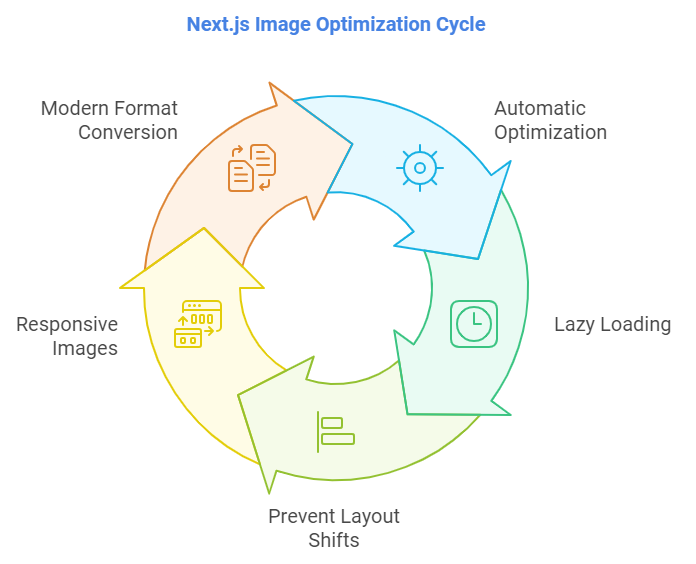
Next.js gives us the magical <Image /> component that handles:
- Automatic optimization
- Lazy loading
- Preventing layout shifts
- Responsive images
- Modern format conversion

Here’s a simple example to get you started:
import Image from 'next/image'

function MyComponent() {
  return (
    <Image
      src="/profile.jpg"
      alt="Profile picture"
      width={500}
      height={300}
      priority={false}
    />
  )
}🏃♂️ Performance Benefits of Nextjs Image
Here’s what makes the Next.js Image component special:
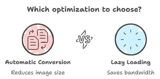
- Automatic WebP/AVIF Conversion: Your images are automatically converted to modern formats like WebP and AVIF when browsers support them. This can reduce image size by up to 50%!
- Lazy Loading: Images outside the viewport aren’t loaded until needed, saving bandwidth and improving initial page load times.

// Images with lazy loading by default
<Image
  src="/large-image.jpg"
  alt="Lazy loaded image"
  width={700}
  height={475}
/>

// Priority images for above-the-fold content
<Image
  src="/hero-image.jpg"
  alt="Hero image"
  width={1200}
  height={600}
  priority
/>
🎨 Responsive Images Made Easy
One of my favorite features is the built-in responsive image handling:
// Dynamic image sizing
<Image
  src="/responsive-image.jpg"
  alt="Responsive image"
  fill
  sizes="(max-width: 768px) 100vw,
         (max-width: 1200px) 50vw,
         33vw"
  className="object-cover"
/>
⚡ Best Practices From the Trenches
After optimizing images for numerous production applications, here are my top tips:
- Use
priorityWisely: Only use it for above-the-fold images. As noted in the Next.js documentation, overusing priority can hurt performance. - Proper Aspect Ratios: Always maintain aspect ratios to prevent layout shifts:
<div className="aspect-w-16 aspect-h-9 relative">
  <Image
    src="/blog-header.jpg"
    alt="Blog header"
    fill
    className="object-cover"
  />
</div>- Loading States: Consider adding blur placeholders for a smoother experience:
<Image
  src="/product-image.jpg"
  alt="Product"
  width={400}
  height={300}
  placeholder="blur"
  blurDataURL="data:image/jpeg;base64,/9j/4AAQSkZJRg..."
/>
🤔 FAQ Section of Nextjs image
Q: Does Next.js Image component work with external images?
A: Yes! Just add the domain to your next.config.js:
module.exports = {
  images: {
    domains: ['example.com'],
  },
}
Q: What about responsive images?
A: Use the sizes prop along with fill or specific dimensions. The component automatically generates srcset for different viewport sizes.
Q: Will it affect my build time?
A: No! Images are optimized on-demand when requested, not at build time.
Q: What formats are supported?
A: The component supports JPEG, PNG, GIF, WebP, and AVIF formats. Check out the full list of supported formats.
🎯 Final Thoughts
The Next.js Image component is more than just a wrapper around the <img> tag – it’s a complete image optimization solution that can significantly improve your website’s performance. According to Core Web Vitals reports, implementing proper image optimization can improve LCP (Largest Contentful Paint) by up to 47%.
Want to level up your Next.js skills further? Check out the amazing Next.js learning platform for more optimization techniques and best practices.
Remember, great performance isn’t about following rules blindly – it’s about understanding your use case and making informed decisions. Happy coding! 🚀
Did this guide help you optimize your Next.js images? Share your experience or drop any questions in the comments below!


![How to Build a Smart Order Fulfillment System with MongoDB & Node.js [2024 Guide] warehouse management](https://devnotes.tech/wp-content/uploads/2024/11/warehouse-management-150x150.jpg)


